
In modern business schools, the days of submitting a market research paper filled with nothing but endless walls of text and raw, unformatted data tables are completely over. Professors and grading rubrics no longer just look at whether you gathered data; they look closely at how well you understand it and how clearly you can present it. When you are looking at thousands of lines of consumer survey responses, complex demographic breakdowns, or multi-channel digital analytics, trying to explain those patterns using only sentences is incredibly difficult. That is where data visualization software comes in, turning chaotic numbers into clear, high-scoring visual stories.
For any business student rushing to meet tight university deadlines, trying to master these complex visual tools while simultaneously writing a deep strategic analysis can feel entirely overwhelming. If you find yourself buried under heavy coursework, getting expert marketing assignment help from myassignmenthelp.com is a highly reliable way to ensure your data synthesis meets rigorous university grading benchmarks. Delegating the tedious formatting, literature reviews, and structural layouts to domain-specific professionals lets you focus your energy on learning the actual software tools that will help you succeed in your career.
Why Visual Data Wins the Highest Marks
When a professor opens your market research document, they usually scan it before reading every single word. If they see well-designed charts, clear graphs, and clean infographics, they instantly know that you have successfully processed the research data. Data visualization software helps you spot hidden trends—such as a sudden shift in consumer preferences among a specific age group—that you might completely miss if you were just staring at a basic spreadsheet.
By converting raw numbers into visual formats, you make your arguments incredibly easy to follow. Instead of writing three long paragraphs trying to explain how a competitor dominates a certain region, a single interactive map can prove your point in less than two seconds. This level of clarity shows advanced analytical skills, which is exactly what lifts a paper from an average grade to a top score.
Plaintext
[ Raw Survey Data ] ───> [ Data Cleaning in Excel/SPSS ]
│
▼
[ High-Scoring Academic Paper ] ◄─── [ Strategic Analysis ] ◄─── [ Visualization Software ]
Top 4 Tools for Student Market Research
You do not need to be a professional data scientist or an expert computer programmer to start building beautiful visuals for your university papers. Several accessible, industry-standard software platforms can help you completely transform your raw assignment data:
- Tableau Public: This is an incredibly powerful, free tool used by major companies worldwide. It is perfect for connecting large consumer datasets and turning them into interactive dashboards, making it excellent for advanced case studies.
- Microsoft Power BI: If you already know how to use Excel, Power BI feels very familiar. It allows you to build highly detailed charts and matrix grids that track key performance indicators, helping you map out market trends perfectly.
- Google Looker Studio: This tool is completely free and connects instantly with Google Analytics and Google Sheets. It is the absolute best choice for digital marketing assignments where you need to show live website traffic or social media engagement trends.
- Canva / Venngage: If your assignment requires a more creative touch, these drag-and-drop design tools are ideal. They offer pre-made templates specifically designed for infographics, allowing you to turn simple percentage metrics into engaging visual graphics.
No matter which tool you choose, the goal is always the same: make the data as simple and easy to understand as possible for the person grading your paper. When deadlines are approaching fast and you feel stuck on how to handle your workload, typing a quick request like do my assignment can instantly connect you with expert academic support to keep your grades on track.
Step-by-Step Guide to Visualizing Your Assignment
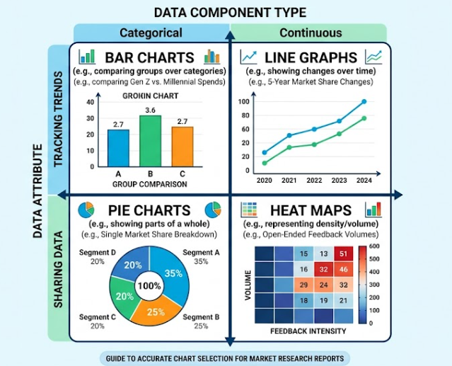
To build a truly effective market research report, you need to follow a clean, logical process. Dumping a bunch of random pie charts into your document without any real structure will only confuse your readers and lower your score. Instead, use this straightforward system to ensure your visual assets directly support your academic arguments.
1. Clean Your Data First
Before you ever import a single number into a visualization tool, you must make sure your data is clean and organized. Go through your survey results or market data and remove any incomplete answers, duplicate entries, or obvious errors. If your raw data is messy, your final charts will look confusing and inaccurate. Spending fifteen minutes cleaning your spreadsheet saves you hours of frustration later.
2. Match the Chart to the Metric
Every type of data has a specific visual format that represents it best. Choosing the wrong layout is a very common mistake that can make your report look highly unprofessional:
- Bar Charts: Use these when you want to compare different distinct categories, such as comparing the brand preferences of Gen Z versus Millennials.
- Line Graphs: These are the absolute best choice for showing trends over time, like tracking the rise or fall of a company’s market share across five years.
- Pie Charts: Only use these when you are showing how a single whole thing is divided into smaller parts, and limit them to five slices or fewer so they remain readable.
3. Keep Your Design Clean and Focused
When it comes to academic data presentation, less is always more. Avoid the temptation to use twenty different bright colors or complex 3D chart effects, which distract from the actual facts. Stick to a simple, consistent color palette with two or three clean tones. Make sure your font sizes are large enough to read easily, and always double-check that your axis labels, chart titles, and legends are perfectly clear.
Connecting Visuals to Strategic Marketing Frameworks
A beautiful chart is only valuable if you explain exactly what it means for business strategy. To get the highest possible marks, you must explicitly link your data visuals to the core marketing theories you are learning in class, such as a SWOT analysis, the 4Ps of marketing, or PESTLE frameworks.
| Marketing Framework Component | Best Data Visual Match | Academic Purpose | Key Metrics to Include |
| Competitor Analysis | Side-by-Side Bar Charts | Displays market share differences clearly. | Share of Voice, Revenue, Store Locations |
| Target Audience Demographics | Segmented Donut Charts | Breaks down target consumer age and income. | Median Income, Age Tiers, Location |
| Market Growth Trends | Multi-Line Trend Graphs | Tracks industry demand shifts over time. | Annual Sales, Search Volume, Growth Rates |
| Consumer Sentiment | Word Clouds & Heat Maps | Visualizes open-ended customer feedback data. | Review Scores, Customer Pain Points |
For example, if you create a chart showing that consumer interest in eco-friendly packaging has doubled over the last three years, do not just leave the graph sitting on the page alone. Write a paragraph right below it explaining how this visual data proves a shift in the “Environmental” section of your PESTLE analysis. Explain how a company must adapt its product packaging strategy to stay relevant based on the exact trends shown in your image. This seamless combination of technical software skills and deep theoretical knowledge is the ultimate secret to earning a perfect grade.
Advanced Visualization: Mapping the Customer Journey
For higher-level marketing assignments, such as digital campaign proposals or consumer behavior papers, simple bar charts might not be enough to get you an A grade. Professors love to see that you understand the modern multichannel marketing funnel. Using specialized software to create flowcharts or funnel diagrams demonstrates that you understand how a consumer transitions from discovering a brand to making a purchase decision.
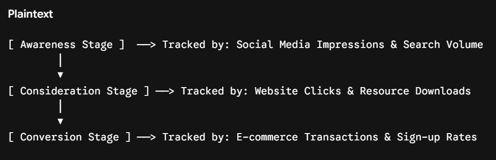
When you present your data in a funnel format, you can easily point out where a business is losing potential customers. For instance, if your visualization shows huge traffic at the awareness stage but a massive drop-off at the consideration stage, you can immediately provide a strategic recommendation. You can suggest that the company needs to improve its website content or landing page layout to keep users engaged. This moves your assignment beyond basic data reporting and turns it into a high-level strategic business proposal.
Avoiding Common Visual Pitfalls That Lower Your Grade
While data software is incredibly useful, it can also lead to mistakes if used incorrectly. A poorly designed chart can actually hurt your grade more than a plain text table. Here are the most critical mistakes you must avoid when putting your marketing reports together:
Overcomplicating the Visuals
Just because a software platform allows you to create complex radar charts or multi-layered scatter plots does not mean you should use them. If your professor cannot understand what the chart is trying to say within five seconds of looking at it, the visual has failed. Keep your designs straightforward and easy to read.
Truncating the Y-Axis
This is a serious data error that can make your research look dishonest. When you change the starting point of a chart’s vertical axis to something other than zero, it can artificially exaggerate small differences between data points. Always start your axis scales at zero unless there is a very specific, mathematically sound reason to do otherwise.
Neglecting the Written Context
Never assume that a chart can speak entirely for itself. Every single visual element in your assignment must be accompanied by an analytical explanation in the text. Use your paragraphs to highlight the most important takeaways from the graph, pointing out exactly what the data implies for the business case study you are analyzing.
Final Checklist Before You Submit
Before you export your final market research paper as a PDF and hit the submit button, take a few minutes to step back and review your work with a fresh pair of eyes. Make sure every single chart has a clear, descriptive title that tells the reader exactly what they are looking at. Check that you have properly cited the original sources of your data right underneath each visual asset to maintain strict academic integrity.
Most importantly, ensure that your text and your visuals work together as a team. Your written paragraphs should guide the professor’s eyes directly to the key points in your charts, while the charts should provide undeniable proof for the arguments made in your text. By mastering this balance and utilizing the right software tools, you will transform your market research assignments into highly professional, page-one-worthy academic reports.
About The Author
Emma Jones is a senior academic writer and content strategist at myassignmenthelp.com. With over a decade of experience in business education, she specializes in translating complex data analytics and modern marketing frameworks into actionable guides for university students worldwide.